 Hamed Rezaie
Anatomy of a Product Page That Sells
What makes a product page sell: clear title and price, useful photos, benefit-led copy, answers to objections, reviews, delivery details and speed.
In an online shop the product page does the work of a salesperson, a shelf and a brochure at once. Visitors cannot touch the item or ask a question, so the page has to answer everything before doubt sends them elsewhere. Here is what a product page needs, from the top of the screen down.
Above the fold: the decision area
The first screen should contain everything needed to decide:
- A descriptive title that includes the type, key feature and model, the way a customer would search for it.
- The price, including whether tax and delivery are included.
- Availability and delivery time.
- Variants such as size and colour, with unavailable options clearly marked.
- One primary button. "Add to cart" should be the most visible element on the page.
If a visitor has to scroll to find the price or the button, the page is losing sales.
Photos that replace touching
- Several angles on a clean background.
- At least one photo in use or for scale.
- Close-ups of material and details.
- Consistent lighting and proportions across the whole catalogue.
Compress images and set their dimensions so the page stays fast. A short video helps for products that need demonstration.
Copy: benefits first, specifications second
Start with what the product does for the buyer, then list the specifications in a table. Compare:
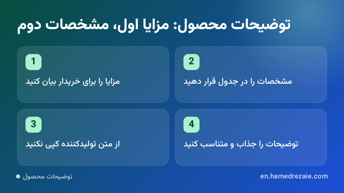
- Weak: "High-quality backpack with many features."
- Strong: "Carries a 15-inch laptop and a change of clothes; the padded back keeps it comfortable on a 40-minute commute."
Do not copy the manufacturer's text. Hundreds of shops use the same paragraph, and search engines have no reason to show yours.
Answer objections on the product page
Every unanswered question is a reason to leave. Cover the usual ones near the button:
- Delivery cost and time.
- Returns and warranty.
- Payment options and security.
- Sizing or compatibility.
A short FAQ built from real customer questions works well, and it reduces support messages.
Reviews and trust
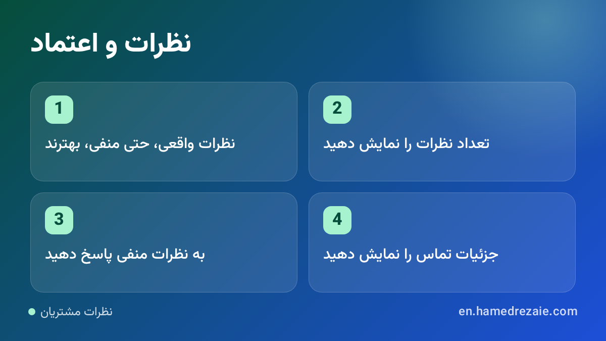
Real reviews, including imperfect ones, convert better than a wall of five stars. Show the number of reviews, allow photos, and reply to negative reviews politely with a solution. Add visible contact details and a physical address where you have one.
Help the next step
- Related products and accessories.
- A size guide or comparison table.
- A stock notification when an item is unavailable, instead of a dead end.
SEO for the product page
- A unique title tag and meta description for every product.
- Product structured data with price, availability and rating.
- A clean, readable URL.
- Out-of-stock pages kept alive with alternatives rather than deleted.
Speed and mobile
Most shopping sessions are on phones. The button must stay reachable, images must load quickly and the variant selector must be easy to tap. Check the numbers that matter in Core Web Vitals explained.
What to measure
Track three numbers per product: views, add-to-cart rate and purchase rate. A high view count with a low add-to-cart rate points to the page (price, photos, copy). A high add-to-cart rate with a low purchase rate points to checkout, delivery cost or trust. More diagnoses are in why your online store is not selling.
Summary
A product page that sells puts the title, price, availability and button on the first screen, shows the product clearly, explains benefits before specifications, answers objections, proves trust with reviews and loads fast on a phone.
FAQ
How long should a product description be? Long enough that the customer does not need to contact you or search elsewhere. Simple items need a few lines; expensive or technical ones need more.
Should I show out-of-stock products? Yes, with a notification option and alternatives. Deleting the page throws away its search traffic.
Do reviews help SEO? They add unique, relevant content and can enable rating stars in search results when marked up correctly.